UX Design and Branding
Overview:
Refining the design and branding of the core loop for a fighter game, a few months before the launch date.
Challenge:
The client had 8 weeks left before their game launch date. They asked our team for aid in increasing brand alignment between the UFC brand and UFC Strike, as well as player enjoyment. I led research operations and UX/UI design.
The game was intended to be a roster management system game and required optimization for that style of play. With the contract providing 8 weeks before the Early Alpha Launch, we had limited player input on the game itself.
The company needed a way to enhance brand alignment and increase player enjoyment before their Early Alpha Launch date.
Role
UX/UI Designer
For
Creating Core UX Loop and Branding for a new UFC game with an active 100K+ NFT collectors and an sports audience of 700m+
Companies
UFC
Concept Art House
Research:
The early alpha launch would only include the first sparring mode, so additional needs included hinting at future gameplay modes coming soon.
I started by creating a system breakdown of the game, providing a detailed visual overview of how the game flow worked. By analyzing patterns of ongoing issues, I identified commonalities we could target for the best impact within the short timeframe.
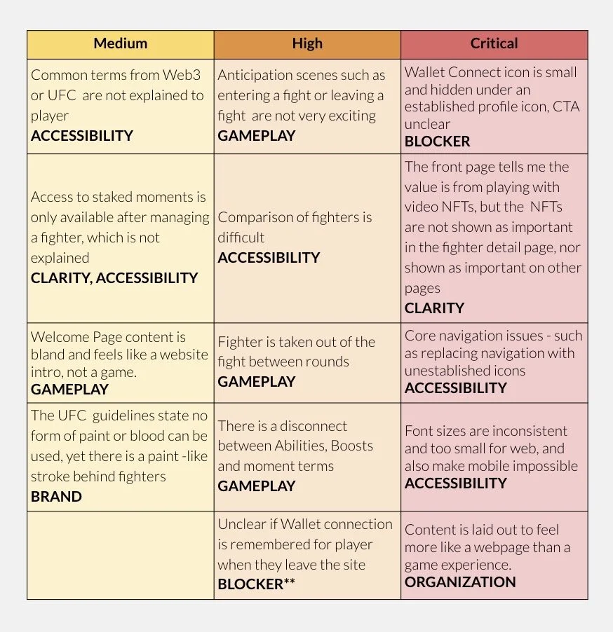
I created an overall category assessment of the game showcasing the medium, high and critical pain points found in the game loops. Using a tagging system, each cell of the table corresponds to overall categories. These were assessed by observations of players and competitive analysis.
Design and Iteration:
I identified the combat flow as the primary pathway for players in the game. Key decision points before combat created friction in player engagement with the action. I pinpointed areas where decision-making needed to be more intuitive.
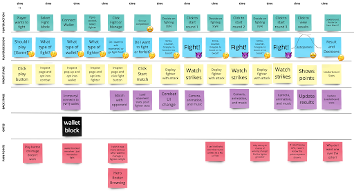
The designers intended for players to get into the combat rounds. I focused on simplifying the beginning stages before the combat rounds to strengthen players' early motivation to play and return for future fights. With a solid understanding of the product, I kept the branding guidelines in mind as I used wireframes to convey the new core game loop and informed the client via daily Loom, Slack, and Figma communication.
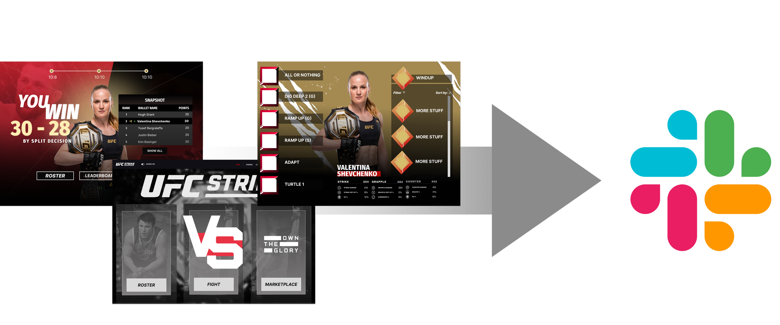
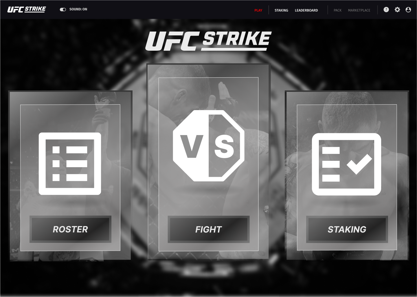
The three-section repetitions were paramount to keep awareness of future fighting types and additional game loops that devs weren’t ready to reveal but wanted the player's anticipation.

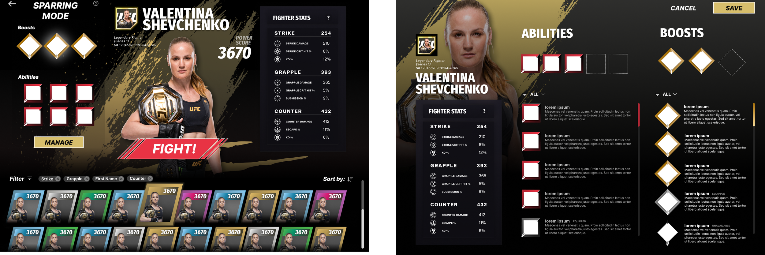
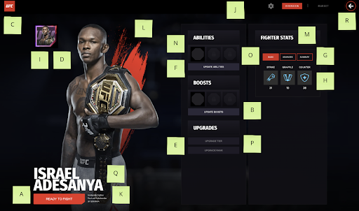
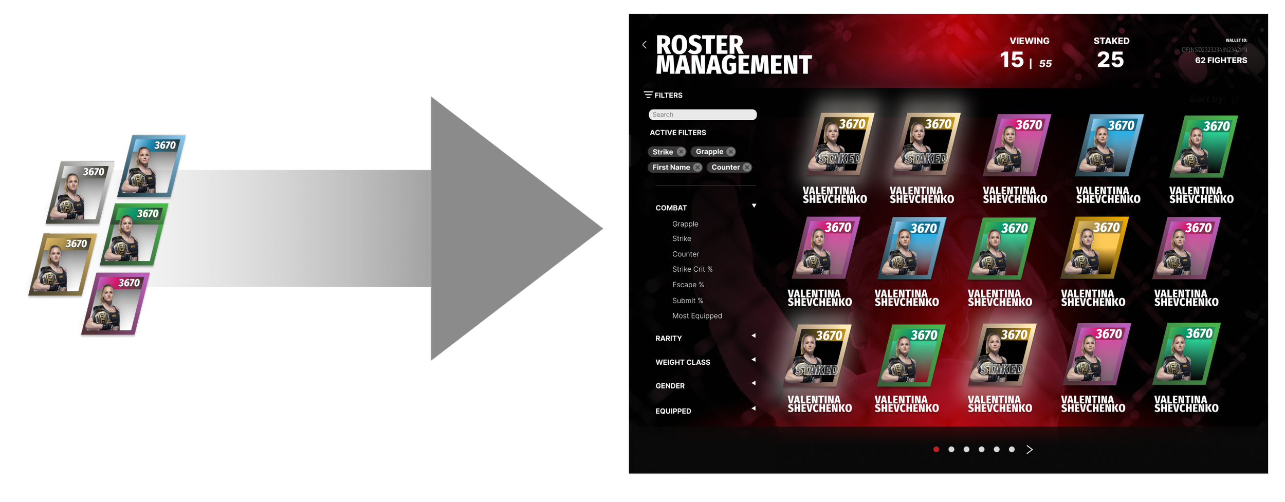
To address different fighter rarities, I created cards with easily scannable frames for the roster management system and the spacing layout for readability. This game used a function called staking to showcase active fighters, thus a staked mode had to be shown in the roster management screen. Due to design restrictions, we could not design beyond the fighter borders and so the solution was to use a darkened interior and the words “Staked” across the fighter.
Fighter detail selection includes abilities and boosters, with the function to save selections onto the fighter. Pages allowed for details without overwhelming the player.

End fighting pages keep the design constraints, branding requirements and game mechanics central while pulling the design together.

Conclusion:
Our client felt satisfied with the main core loop, branding, and auxiliary game loop changes!
Early user testing showed a decrease in decision-making time for players to reach the combat stage.
Reflection:
With our international team, providing daily updates helped everyone understand the pace and helped with accountability. If I worked on a similar project in the future, I would spend more time understanding the nuances of expectations. This increased understanding would foster early trust and enhanced communication during the project. This project provided me with a strong focus on building early trust, and building early foundations for a quick yet powerful design in a short timeframe.